The Problem: Ordering a custom pet memorial is emotionally sensitive, yet existing digital experiences are often unclear, fragmented, and overly technical.
The Goal: Design a calm, step-by-step ordering experience that helps users confidently order a personalized sculpture from their pet’s photos.
My Role: UX/UI Designer - Responsive Design (Desktop and Mobile)
My Responsibilities: End-to-end UX/UI design including problem framing, information architecture (IA), user flow, prototyping, and iterative refinement

Project at a Glance
Problem: Emotionally sensitive ordering process is complex and cognitively demanding
Solution: A guided, step-by-step experience that simplifies customization and builds trust
Process: Concept → Information Architecture (IA) → Prototyping → High-Fidelity Design
Outcome: A clear, emotionally supportive flow designed to reduce friction and increase completion confidence
_________________________________________________________________________________________
Why Furry Family Studio?
This project was driven by the challenge of designing for emotional contexts. Ordering a custom pet memorial is not just a transaction. It requires clarity, reassurance, and simplicity. I created this case study to explore how UX design can support users during meaningful and sensitive experiences.
_________________________________________________________________________________________
Empathize
To understand users in emotionally sensitive purchasing situations, I focused on the needs, concerns, and decision-making behavior of pet owners ordering personalized keepsakes.
User Research
Given the conceptual nature of the project, I used a combination of:
• Review of existing custom product websites (Etsy, memorial services, 3D printing services)
• Analysis of user reviews and common complaints
• Experience-based assumptions grounded in emotional UX principles
Key Findings
• Users feel uncertain about photo quality requirements
• Emotional context increases decision hesitation and abandonment risk
• Too many options create cognitive overload
• Technical language reduces trust and comfort
• Users need reassurance that their pet will be represented accurately
User Needs
• Clear, guided steps instead of open-ended customization
• Simple instructions for photo upload
• Minimal, well-structured choices
• Confidence before checkout
The most relevant insights from this process are summarized in the primary persona below (Figure 1).
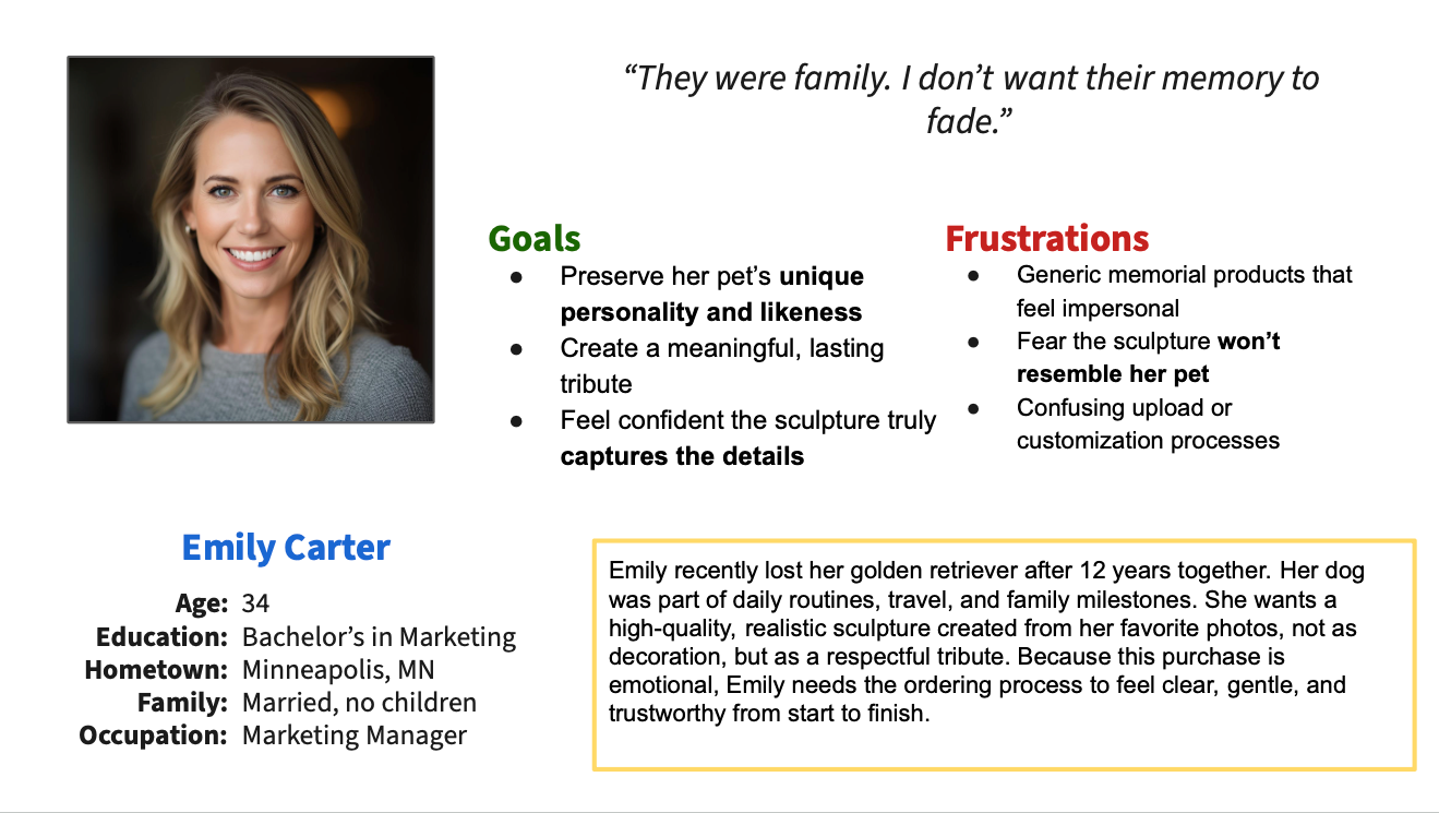
Figure 1. Primary persona representing the main target audience or "ideal customer" for Furry Family Studio.
_________________________________________________________________________________________
What Furry Family Studio Is (and Is Not)
It IS:
• A streamlined ordering platform for a custom physical keepsake
• Emotionally considerate in tone and structure
• Focused on clarity and guided steps
• Responsive across devices
It is NOT:
• A technical 3D configurator
• A production-explanation platform
• A feature-heavy customization tool
• A marketing-heavy storytelling website
_________________________________________________________________________________________
Ideate
To translate the defined problem into a structured solution, I focused on designing a clear, end-to-end ordering flow that balances emotional sensitivity with usability.
Instead of exploring feature-heavy customization, I prioritized a guided experience that reduces decision fatigue and supports users step by step.
Concept Direction
The core idea was to shift from an open, technical customization process to a calm, guided journey that:
• Breaks the experience into manageable steps
• Provides reassurance during key decision points
• Minimizes unnecessary choices
• Keeps users focused on completing the order with confidence
User Flow Thinking
The experience was structured around a simple linear flow:
1. Entry / understanding the service
2. Photo upload (highest friction point)
3. Customization (size, base, simple options)
4. Review and confirmation
5. Checkout
6. Confirmation
This structure was intentionally designed to:
• Reduce cognitive load
• Prevent early overwhelm
• Maintain emotional continuity throughout the process
_________________________________________________________________________________________
Information Architecture
To support a clear and guided ordering experience, I designed a structured information architecture that organizes content into intuitive sections and aligns with the step-by-step user flow.
The goal was to ensure users always understand where they are, what to do next, and what to expect, especially during emotionally sensitive interactions.
Structure Overview
The platform is organized into two main layers:
• Exploration layer (Homepage, Gallery, How It Works, FAQs)
• Action layer (Order flow: upload → customize → review → checkout)
This separation allows users to first build understanding and trust, then move into a focused, task-oriented flow.
Ordering Flow Architecture
The core experience is structured as a linear, guided process:
1. Upload Photos
2. Customize Sculpture
3. Review Order
4. Checkout
5. Confirmation
Each step is designed as a dedicated screen with a single primary action, reducing distractions and improving clarity (Figure 2).
Navigation Approach
• Minimal top navigation to avoid cognitive overload
• Clear entry points into the ordering flow (CTA-driven)
• Reduced cross-navigation during critical steps to maintain focus
Design Rationale
• Prevent users from feeling lost or overwhelmed
• Support a predictable, step-by-step progression
• Separate browsing from decision-making
• Maintain emotional calm through structural clarity

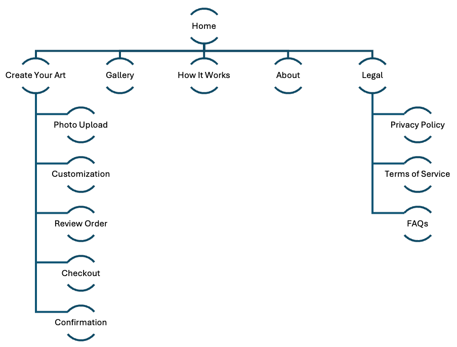
Figure 2. User flow and information architecture (IA) illustrating the guided, step-by-step ordering experience and overall site structure.
_________________________________________________________________________________________
Wireframes & Early Concepts
To translate the information architecture into tangible layouts, I explored multiple structural directions through hand-drawn sketches and low-fidelity digital wireframes.
The focus at this stage was on layout, hierarchy, and flow, not visual styling.
Hand-Drawn Exploration
I began with quick hand-drawn sketches (iPad) to explore:
• Page structure and content hierarchy
• Placement of key actions (CTAs, upload areas)
• Different layout patterns for the homepage and ordering flow
This allowed rapid iteration and comparison of multiple ideas before committing to a digital format (Figure 3).
Digital Wireframes (Figma)
Selected concepts were translated into low-fidelity wireframes in Figma.
At this stage, I focused on:
• Clear visual hierarchy
• Step-by-step flow structure
• Placement of primary vs. secondary actions
• Early responsive considerations
Multiple layout options were combined into a unified, consistent flow across all key screens (Figure 4).
Key Design Considerations
• Prioritized clarity and simplicity over visual richness
• Ensured each screen has a single dominant action
• Structured content to support progressive disclosure
• Designed with responsiveness in mind from early stages
Transition to High-Fidelity
The wireframes established the foundation for the final design direction, defining:
• Screen structure
• Interaction flow
• Content hierarchy
These were then used as the basis for building the high-fidelity prototype in Figma.
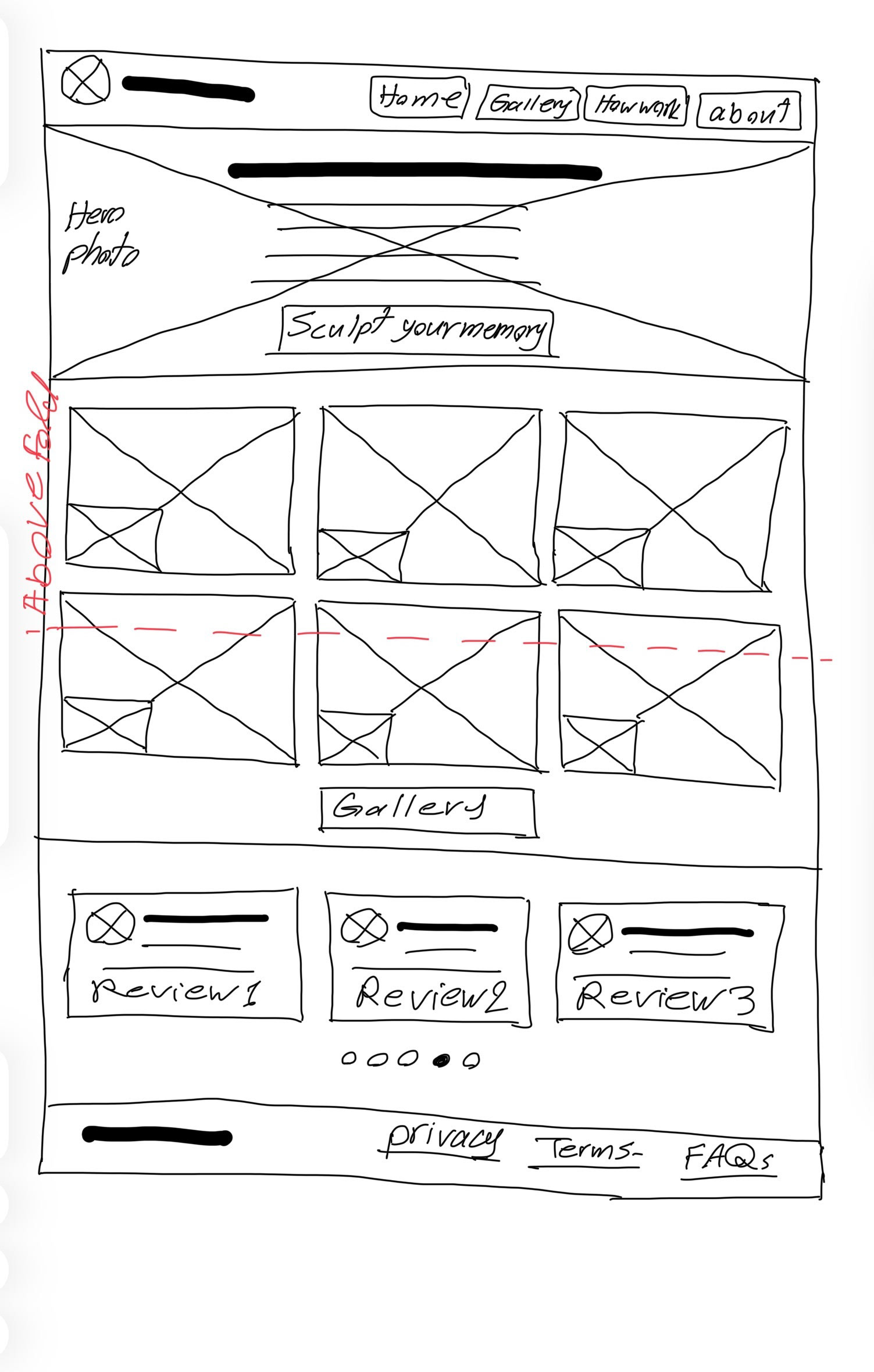
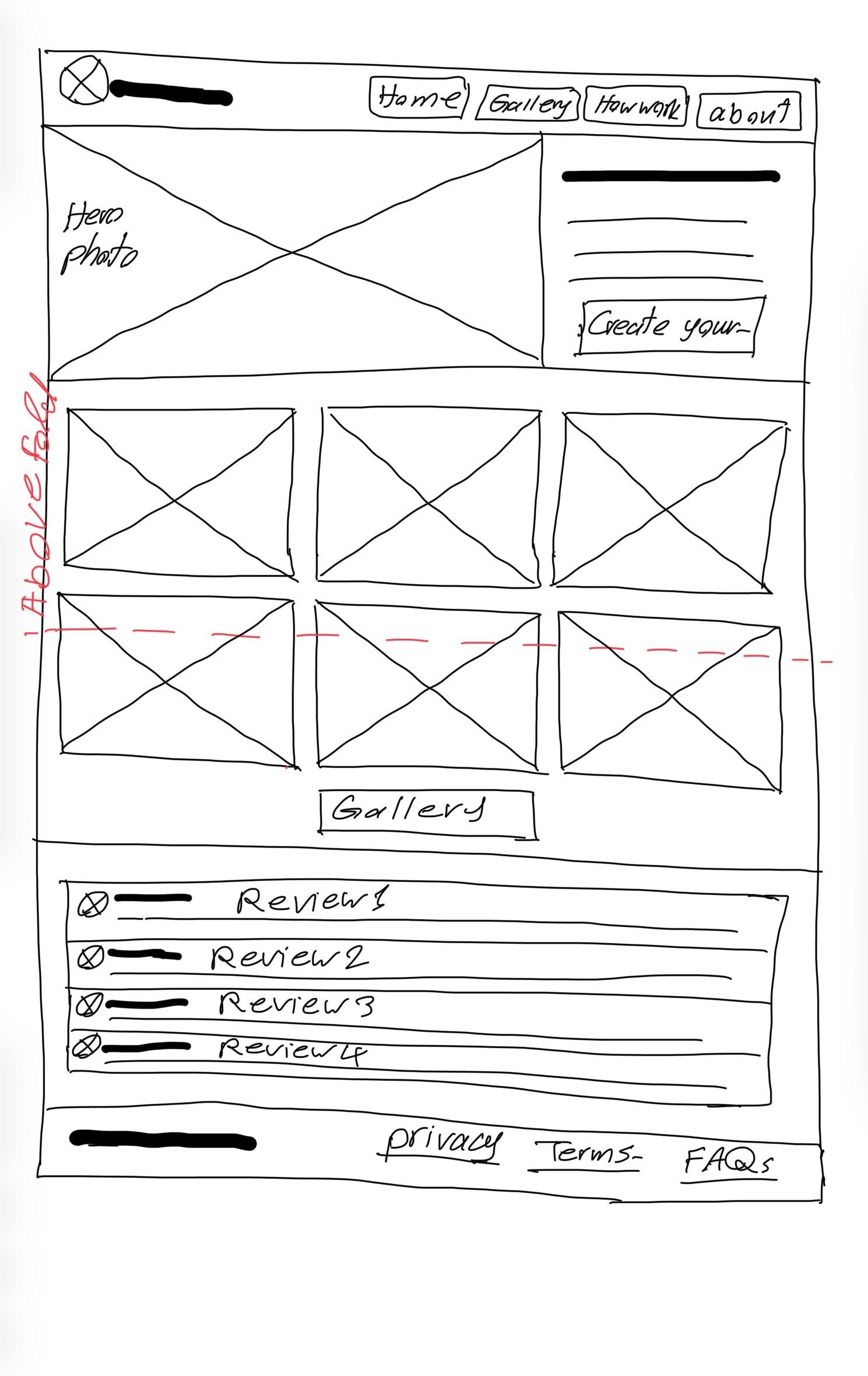
Figure 3. Early hand-drawn wireframes exploring homepage layout, content hierarchy, and key interaction patterns.
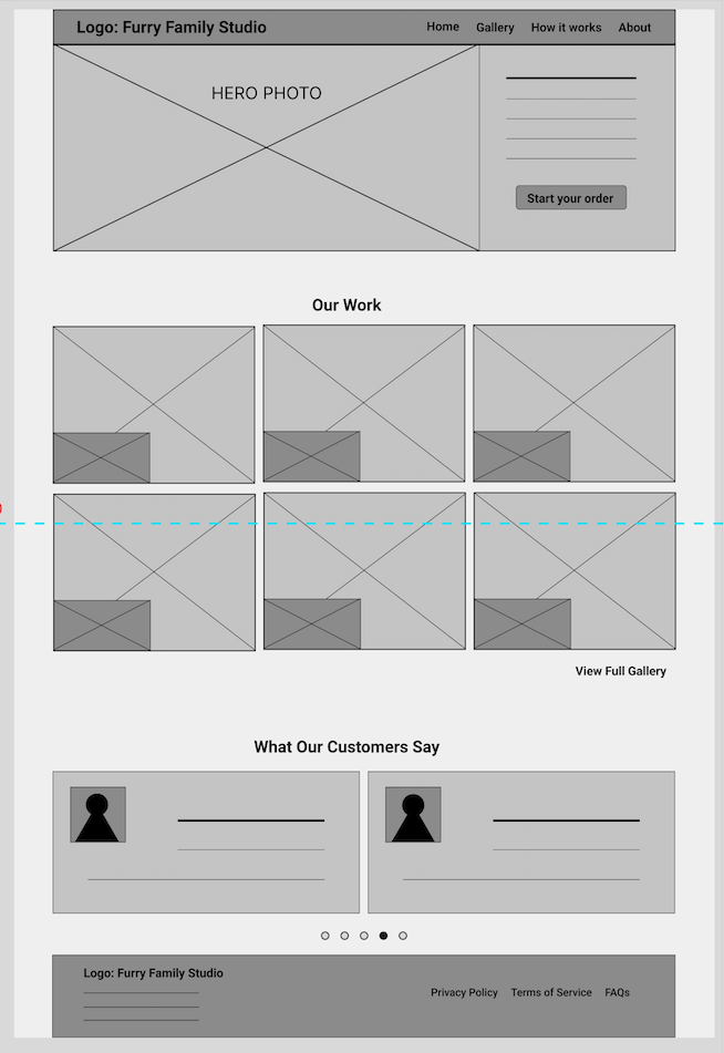
Figure 4. An example of the low-fidelity digital wireframe of the homepage created in Figma, focusing on layout structure and content hierarchy.
_________________________________________________________________________________________
High-Fidelity Design (Desktop)
The high-fidelity design was developed in Figma, translating the wireframes into a polished, cohesive interface focused on clarity, emotional tone, and usability (figures 5-6).
The desktop experience was prioritized as the primary platform, allowing for a structured layout with clear hierarchy and controlled spacing.
Design Focus
The interface was designed to:
• Create a calm and trustworthy visual experience
• Guide users through the process without overwhelming them
• Maintain clarity at every step of the ordering flow
Visual Design Approach
• Clean, minimal layout to reduce cognitive load
• Generous spacing to support readability and focus
• Soft, neutral visual tone aligned with emotional context
• Strong hierarchy to highlight primary actions
Interaction Design
• Step-by-step progression with clear forward movement
• Prominent primary actions on each screen
• Reduced visual noise to maintain user focus
• Consistent layout patterns across all steps
Figma Implementation
The high-fidelity prototype was built entirely in Figma, including:
• Reusable components for consistency
• Structured layout system for alignment and spacing
• Responsive constraints to support different screen sizes
• Interactive prototype demonstrating the full user flow
Key Design Decisions
• Simplified customization to avoid overwhelming users
• Designed the upload step as a focused, guided interaction
• Limited optional inputs to maintain flow clarity
• Reinforced user confidence through structured progression
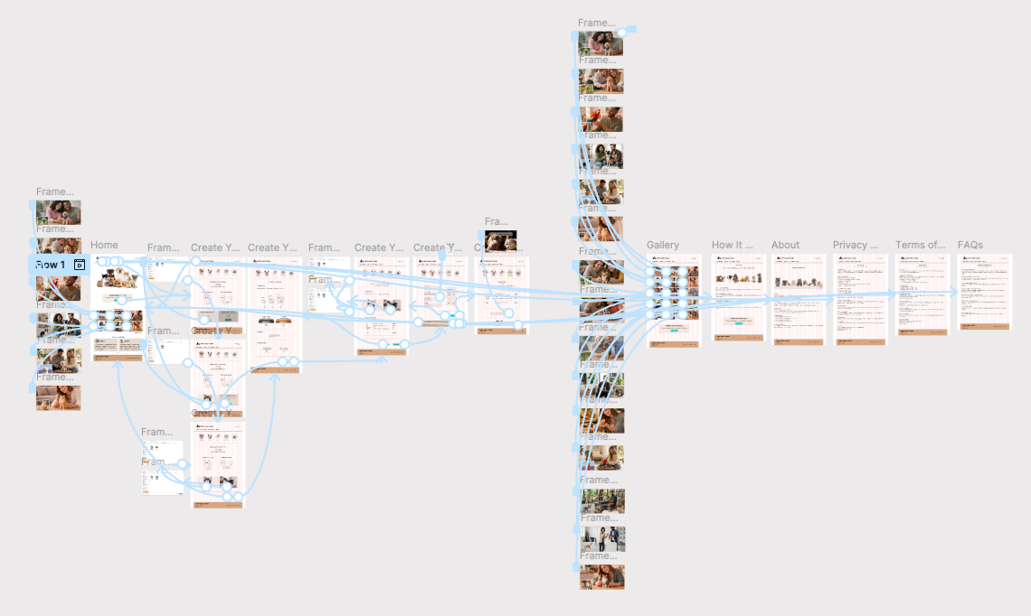
Figure 5. Overview of the high-fidelity desktop prototype in Figma, showing all screens and interaction flows across the user journey.
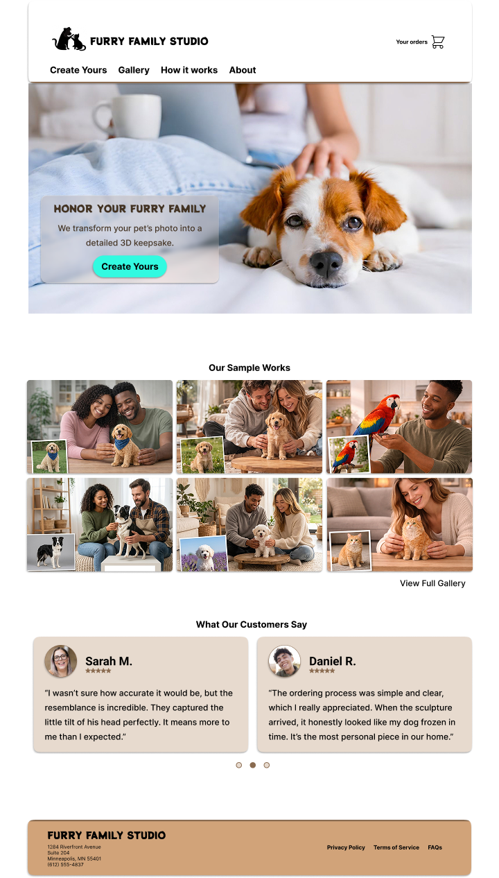
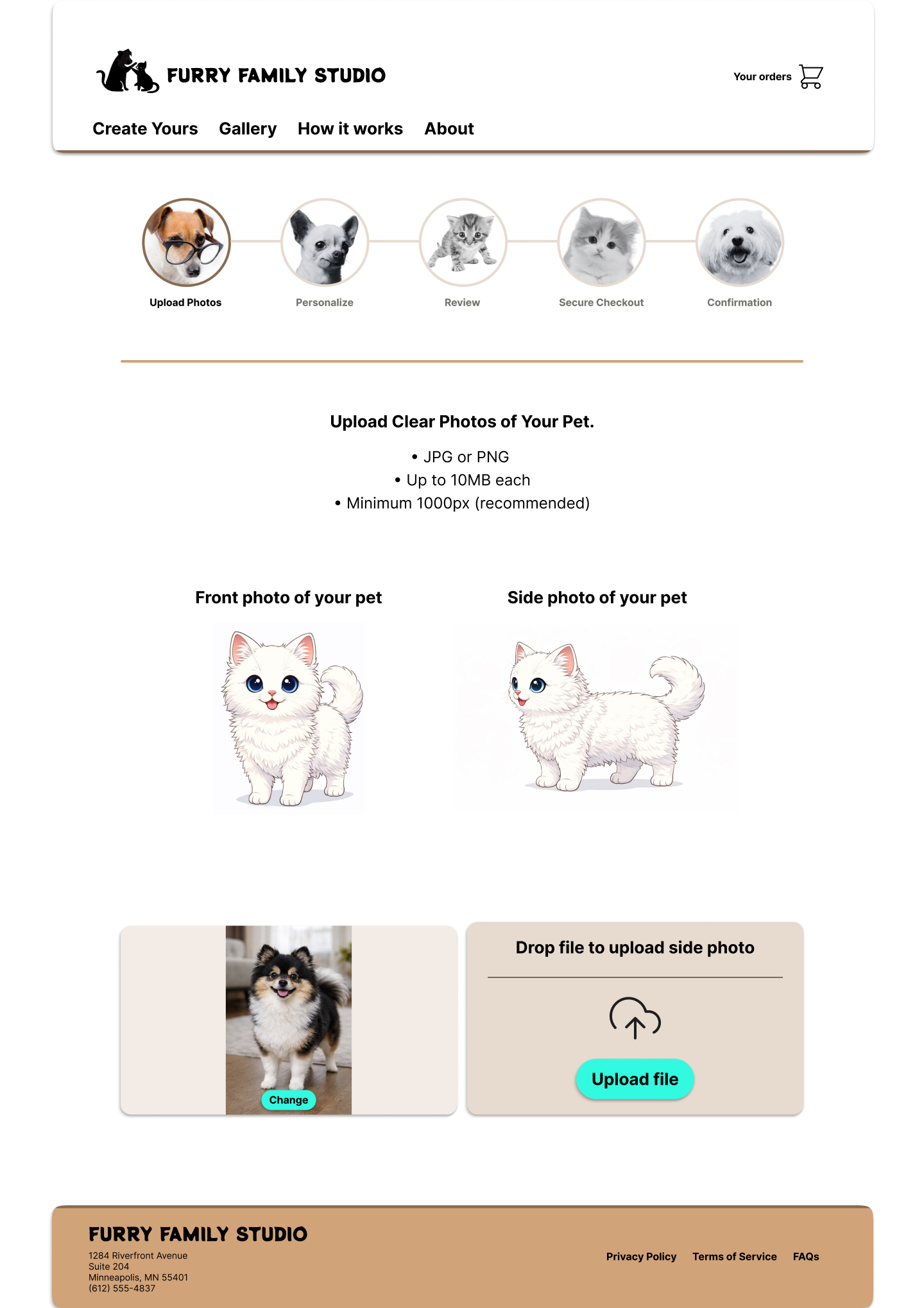
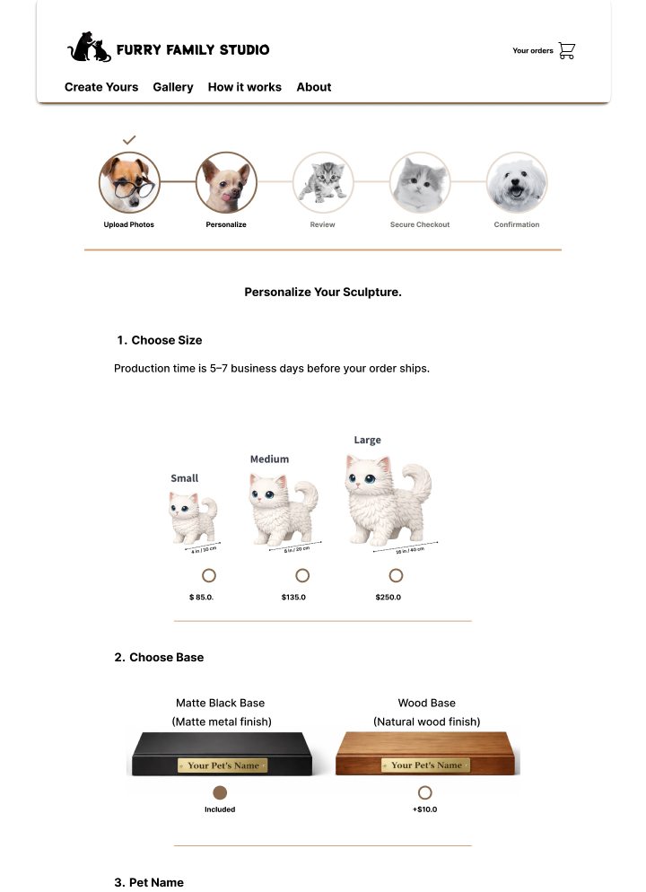
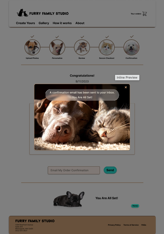
Figure 6. Selected high-fidelity desktop screens illustrating key steps of the ordering experience, including homepage, photo upload, customization, and confirmation.
Try the Live Prototype (Desktop)
The final high-fidelity prototype was built in Figma to demonstrate the complete step-by-step ordering experience for a custom pet sculpture. The interactive prototype below allows users to explore the guided flow and key design decisions focused on clarity, simplicity, and emotional ease.
_________________________________________________________________________________________
Responsive Design (Mobile)
To ensure accessibility across devices, the experience was adapted into a mobile-responsive design in Figma (Figures 7-8).
The goal was to maintain the same clarity, guidance, and emotional tone while optimizing for smaller screens.
Adaptation Approach
• Converted multi-column desktop layouts into single-column mobile flows
• Prioritized vertical scrolling with clear step progression
• Maintained consistent hierarchy and interaction patterns
Design Considerations
• Larger touch targets for key actions
• Simplified layouts to reduce visual density
• Clear spacing between sections to improve readability
• Persistent focus on the primary action at each step
Consistency Across Devices
• Preserved the step-by-step structure of the ordering flow
• Maintained consistent visual language and components
• Ensured a seamless transition between desktop and mobile experiences
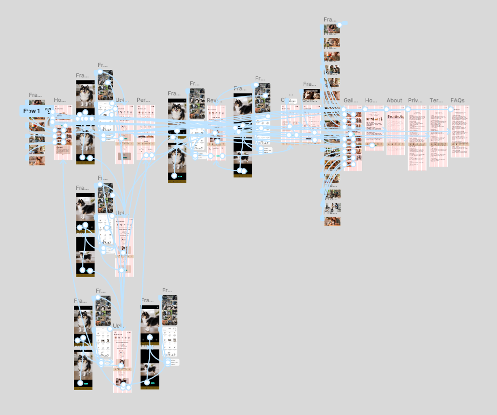
Figure 7. Overview of the high-fidelity mobile prototype in Figma, showing all screens and interaction flows across the user journey.
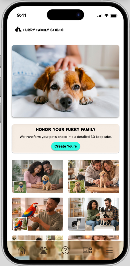
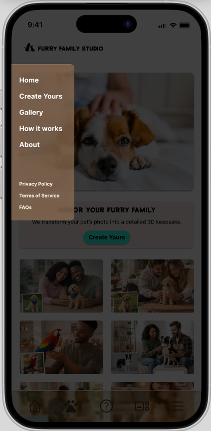
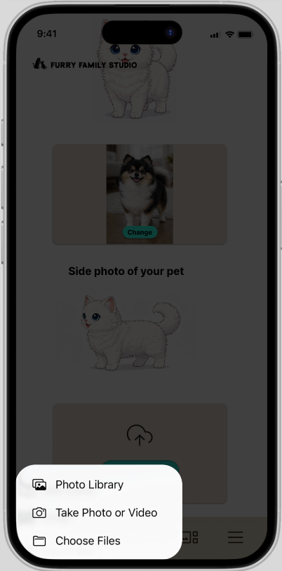
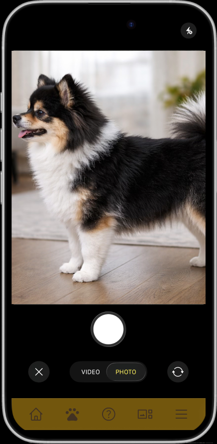
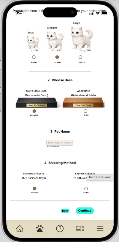
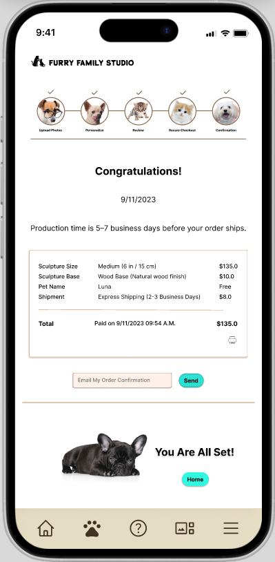
Figure 8. Selected high-fidelity mobile screens illustrating key steps of the ordering experience, including homepage, photo upload, customization, and confirmation.
Try the Live Prototype (Mobile)
The final high-fidelity prototype was built in Figma to demonstrate the complete step-by-step ordering experience for a custom pet sculpture. The interactive prototype below allows users to explore the guided flow and key design decisions focused on clarity, simplicity, and emotional ease.
_________________________________________________________________________________________
Conclusion and Lessons Learned (So Far)
Conclusion
Furry Family Studio explores how a digital experience can support users during an emotionally sensitive process. By prioritizing clarity, guided steps, and a calm interface, the design focuses on reducing cognitive load and helping users move through the ordering process with confidence.
The project demonstrates how structuring interactions and simplifying decisions can improve usability, especially in contexts where emotional factors influence user behavior.
Lessons Learned (So Far)
• Emotional context changes design priorities
Users need reassurance and clarity more than advanced features
Users need reassurance and clarity more than advanced features
• Guided flows reduce hesitation
Breaking the process into steps makes complex tasks manageable
Breaking the process into steps makes complex tasks manageable
• Clarity builds trust
Simple language and structured layouts are more effective than persuasive design
Simple language and structured layouts are more effective than persuasive design
• Less is more in customization
Limiting options improves decision-making and flow continuity
Limiting options improves decision-making and flow continuity
_________________________________________________________________________________________
Next Steps (Usability Testing and Iteration)
This project is currently at the high-fidelity prototyping stage. The next phase will focus on validating and refining the design through structured testing and iteration.
Planned Activities
• Conduct usability testing to evaluate task completion and ease of use
• Validate clarity of the photo upload process (key friction point)
• Assess user confidence during customization and checkout
• Identify usability issues and areas of confusion
Design Improvements (Planned)
• Refine microcopy for clearer guidance and reassurance
• Improve error prevention and feedback during photo upload
• Optimize flow transitions between steps
• Further simplify decision points if needed
Future Considerations
• Expand testing across different user groups and scenarios
• Explore accessibility improvements (e.g., contrast, readability, assistive use)
• Prepare developer-ready specifications and handoff documentation