The Problem: Planning a museum visit for families or groups is often time-consuming and fragmented, requiring users to manage tickets, parking, and activities across multiple platforms.
The Goal: Create a simple, step-by-step experience that helps families and groups easily plan and coordinate museum visits in one place.
My Role: UX/UI Designer (Proof of Concept)
My Responsibilities: End-to-end UX/UI design. I led the full UX/UI process, including research, ideation, testing, and high-fidelity design
Try the Live Prototype
The final high-fidelity prototype was built in Figma to demonstrate the complete step-by-step experience of planning a group museum visit. The interactive prototype below allows users to explore the refined flow and design decisions informed by usability testing.
Project at a Glance
Problem: Planning group museum visits is fragmented and unnecessarily complex
Solution: A guided, step-by-step mobile experience that centralizes visit logistics
Process: Research → iteration → testing → refinement
Outcome: A clear, accessible flow designed to reduce cognitive load and increase user confidence
_________________________________________________________________________________________
Why Mizy?
After moving to Minneapolis, I decided to visit as many museums in the city as possible. I quickly noticed that coordinating museum visits, especially when going with friends, was inefficient and often fragmented across multiple platforms. This observation sparked the idea for Mizy. I decided to define and conduct an independent UX/UI case study to explore how a more streamlined, user-friendly experience could support well-organized group museum visits. The project followed a five-step UX/UI design process, outlined below (Figure 1).
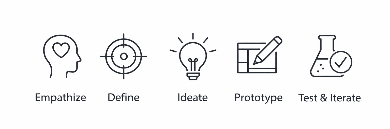
Figure 1. Five-step UX/UI design process guiding the Mizy case study
_________________________________________________________________________________________
Empathize
To understand users and their needs, I conducted user research and developed personas, user stories, and journey maps. The most relevant insights from this process are summarized below (Figure 2).
User Research
I conducted six user interviews focused on the strengths, weaknesses, and improvement areas of existing museum websites and apps. Participants consistently reported outdated design and navigation issues that made planning visits inefficient. In addition, interviews revealed unmet needs around clearer online ticketing, and better access to logistical information, specifically parking, dining options, and children’s activities.
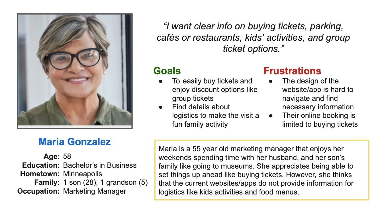
Figure 2. Primary persona representing a multi-generation museum visitor
_________________________________________________________________________________________
Define
Based on user research and a review of existing museum digital experiences, I synthesized the findings to clearly define the core problem and establish a focused design goal (Figure 3).
Competitive Review (Museums)
• Most museums rely on outdated websites rather than dedicated mobile apps
• Navigation is often confusing and difficult to follow
• Visual design is weak, particularly in typography and color use
• Online planning provides little incentive and often takes more time than in-person visits
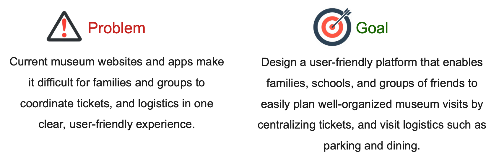
Figure 3. Problem and goal statements defining the design direction for Mizy
_________________________________________________________________________________________
Ideate
To explore potential solutions, I used storyboarding to visualize the end-to-end experience of planning and completing a group museum visit. I first mapped the big-picture user journey to understand the emotional arc and key moments of friction, then created a close-up storyboard to detail the core interaction flow within the app. This approach helped translate user needs into a clear, step-by-step experience focused on reducing planning complexity and supporting a smooth, enjoyable visit.
These storyboards directly informed the structure of the primary user flow and the sequence of screens in the prototype (Figures 4-5).
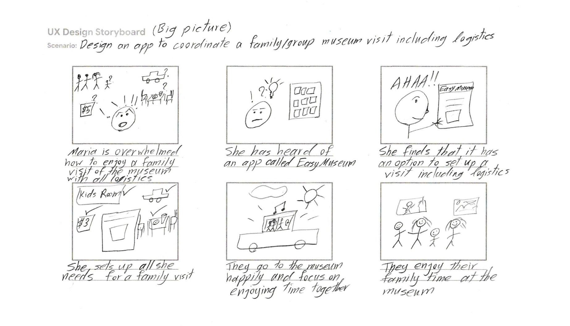
Figure 4. Big-picture storyboard illustrating the emotional journey from frustration to a relaxed family museum visit.
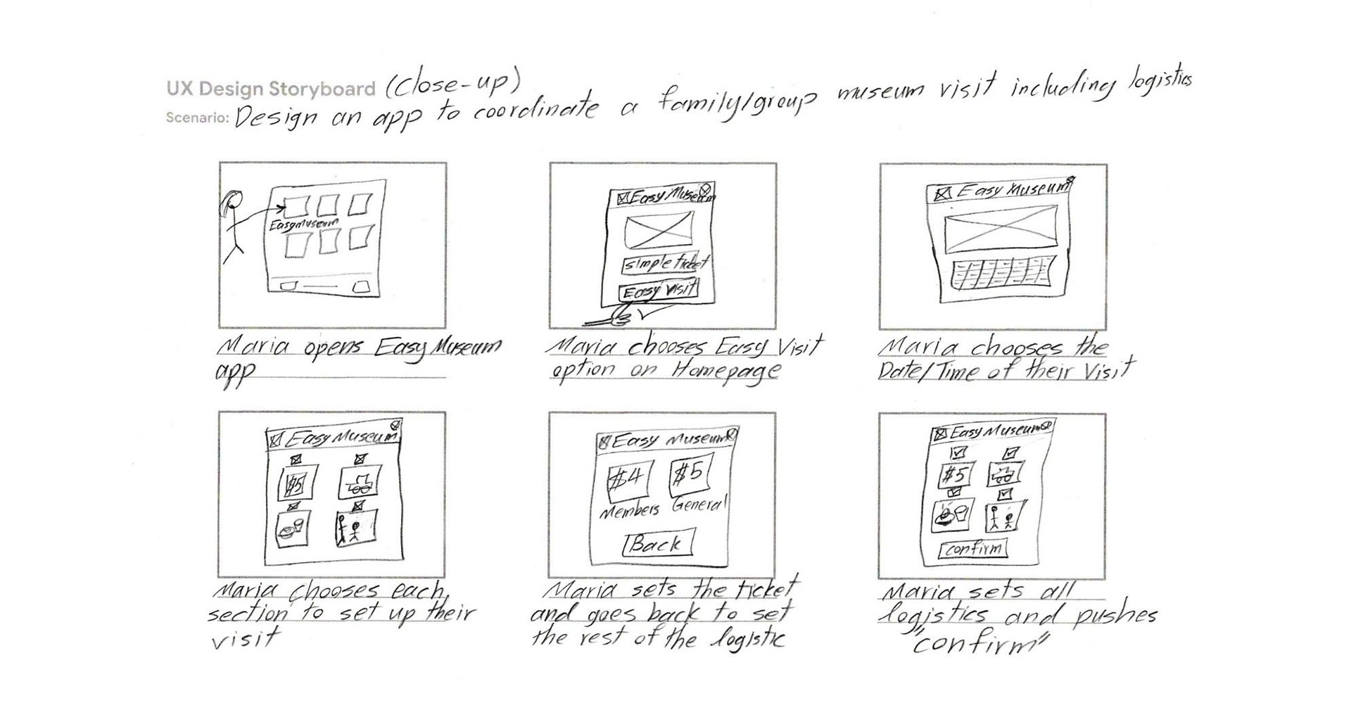
Figure 5. Close-up storyboard detailing the step-by-step interaction flow for setting up a group visit.
_________________________________________________________________________________________
Prototype, Test and Iterate
Prototyping and testing were closely interconnected in this project, with early feedback informing iterative refinements before moving to high-fidelity designs. Thus, prototyping, testing and iteration are presented together in this section.
Wireframes and Low-Fidelity Prototype
After several iterations of each screen of the app on paper the elements that were most useful and well-suited to address user pain points were combined and the following paper wireframe was created to be converted to a digital version in Figma (Figures 6-7). My first priority was to make the app as user-friendly and straightforward as possible for coordinating a family/group museum visit including logistics. This low-fidelity Figma prototype demonstrates a complete user flow across key screens with intuitive forward–backward navigation, clear visual cues, and confirmation messaging that ensures a seamless and comprehensible user experience.
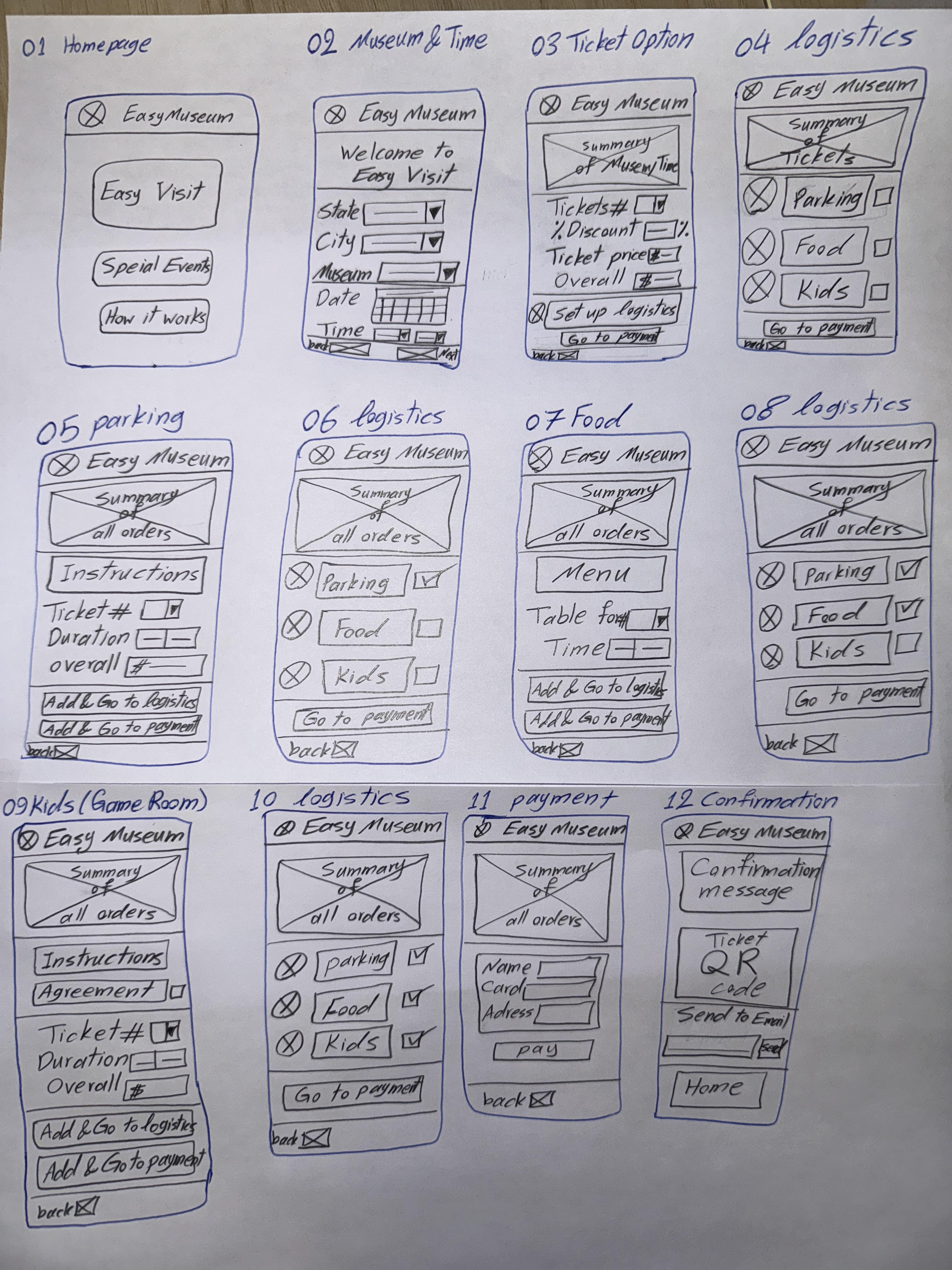
Figure 6. Early hand-drawn wireframes exploring layout and user flow
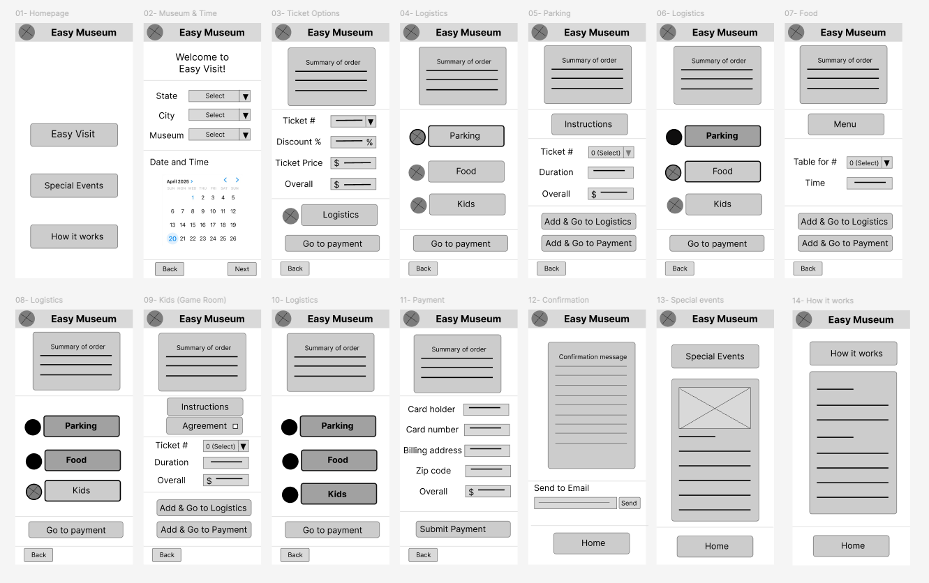
Figure 7. Digital wireframes (Figma). I ensured that user-friendliness was prioritized for a straightforward application.
_____________________________________________________
Early Usability Testing and Iteration
Five usability testing sessions using a think-aloud approach followed by interviews were conducted, and user insights were prioritized. Overall, users found the app useful; however, usability concerns were identified that required further iteration (Figure 8).
Goal
• Validate whether users can easily plan a well-organized group museum visit using the app.
Method
• Moderated remote usability study (20–30 min)
Participants
• Five frequent museum visitors (ages 22–72)
Task
• Plan a family museum visit (tickets, parking, lunch, kid's zone)
Key findings:
• Users valued having all visit logistics in one place
• Most confusion occurred during transitions between planning steps
• Participants requested clearer confirmations and progress feedback
Design impact
• Refined step-by-step flow, improved navigation clarity, and simplified labels and confirmations
Insights
• Refined step-by-step flow, improved navigation clarity, and simplified labels and confirmations
Insights
• Users found "Easy Museum" hard to memorize or recall for future use
• Users asked for a new homepage with categorized search of museums
• Users asked for key inputs in the booking process (e.g., start time for parking)
• Users asked for a more straightforward approach in setting up logistics
In the next iteration, the app was renamed "Mizy" to improve memorability. The homepage was updated to include categorized museum search, and additional detail pages were introduced to provide clearer search results. Finally, a more structured step-by-step flow was implemented, supported by a visual progress indicator at the top of the screens and more detailed booking forms (Figure 8).
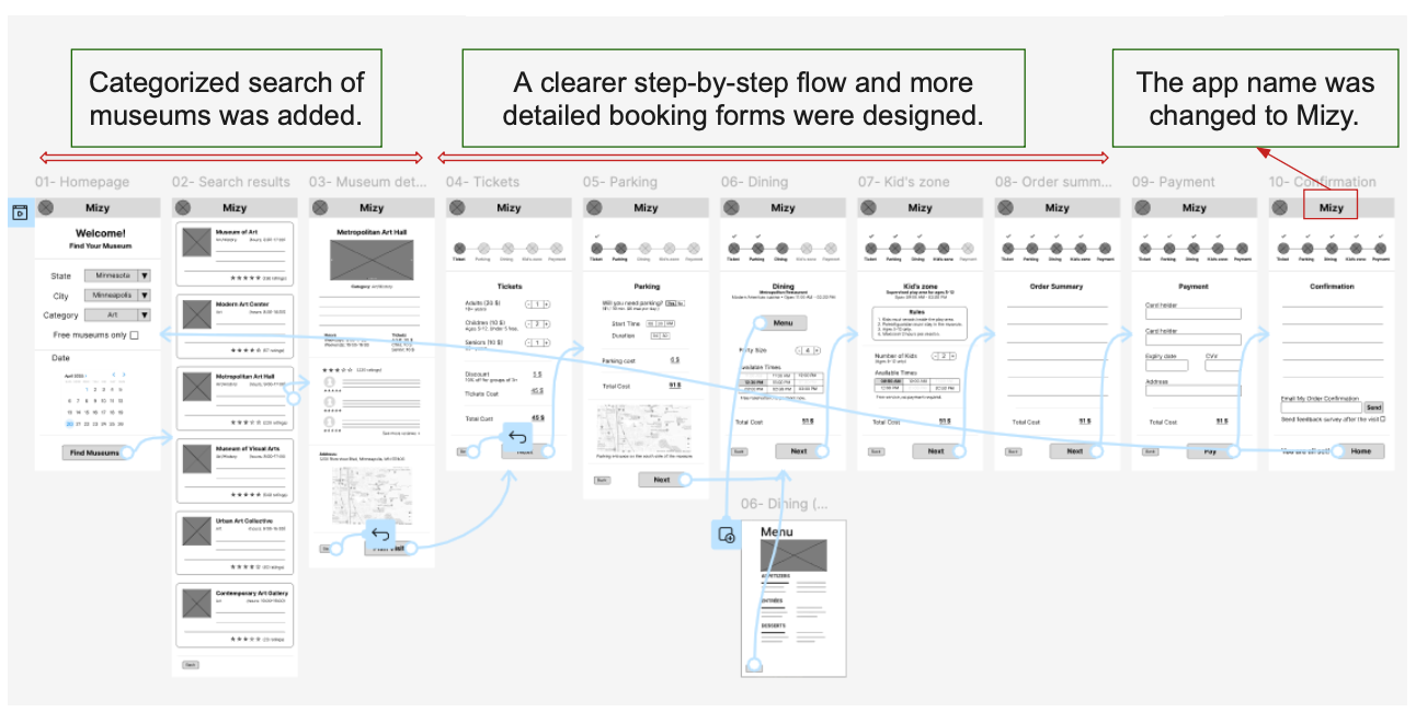
Figure 8. Design refinements to the low-fidelity prototype informed by usability feedback
_____________________________________________________
High-Fidelity Mockup and Prototype
After refining the wireframes based on early usability feedback, I transitioned the design into a high-fidelity mockup in Figma. I began by creating a simple design sheet to ensure visual consistency across screens, including typography, color, and core UI components (Figure 9).
Using this design foundation, I created the first iteration of the high-fidelity mockup to translate the refined wireframes into a polished visual interface and validate layout, hierarchy, and interaction clarity (Figure 10).
Accessibility considerations
Accessibility considerations were incorporated into the high-fidelity design, including sufficient color contrast for text and backgrounds, color combinations mindful of color-vision deficiencies, readable typography that avoids overly small text to support older users, and the use of alternative text for visual content.
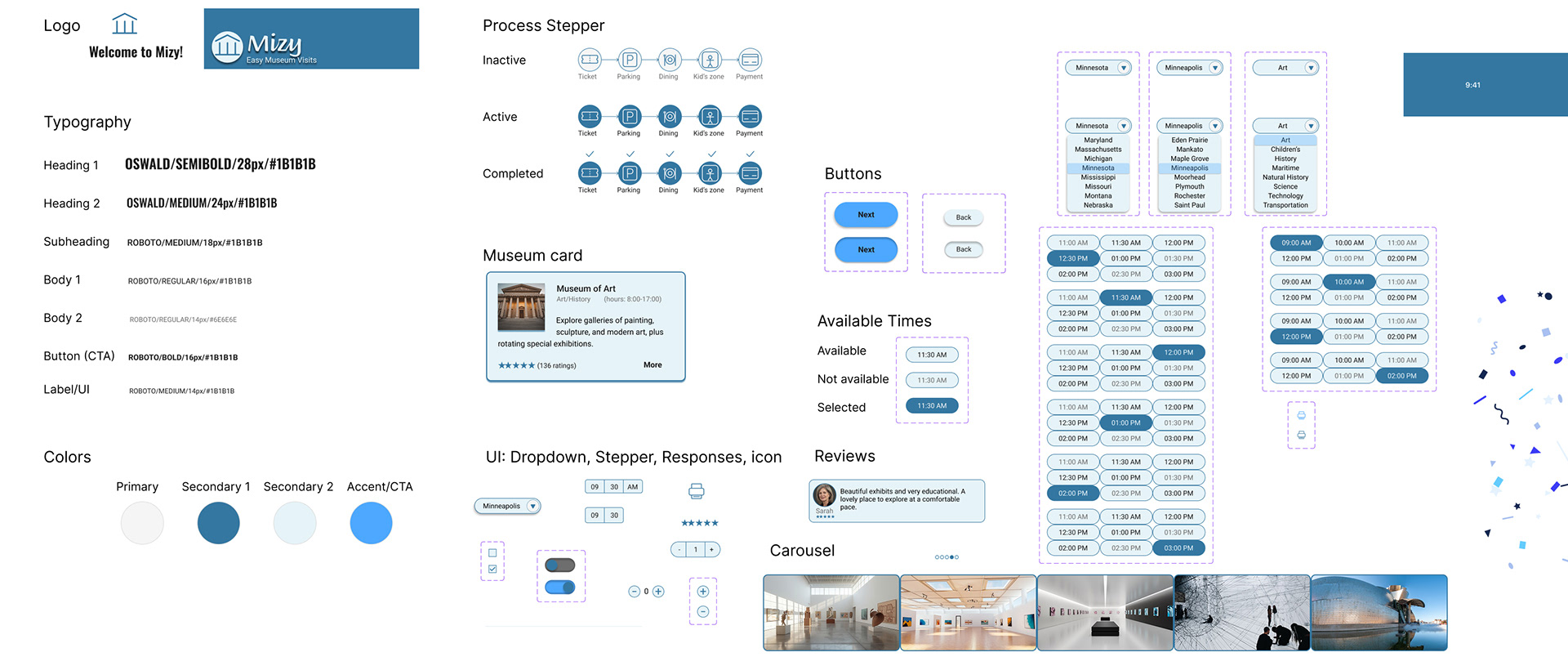
Figure 9. Lightweight design sheet used to guide high-fidelity mockup creation
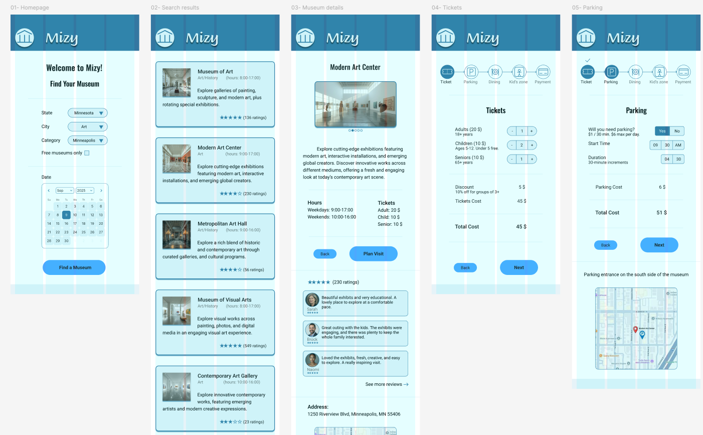
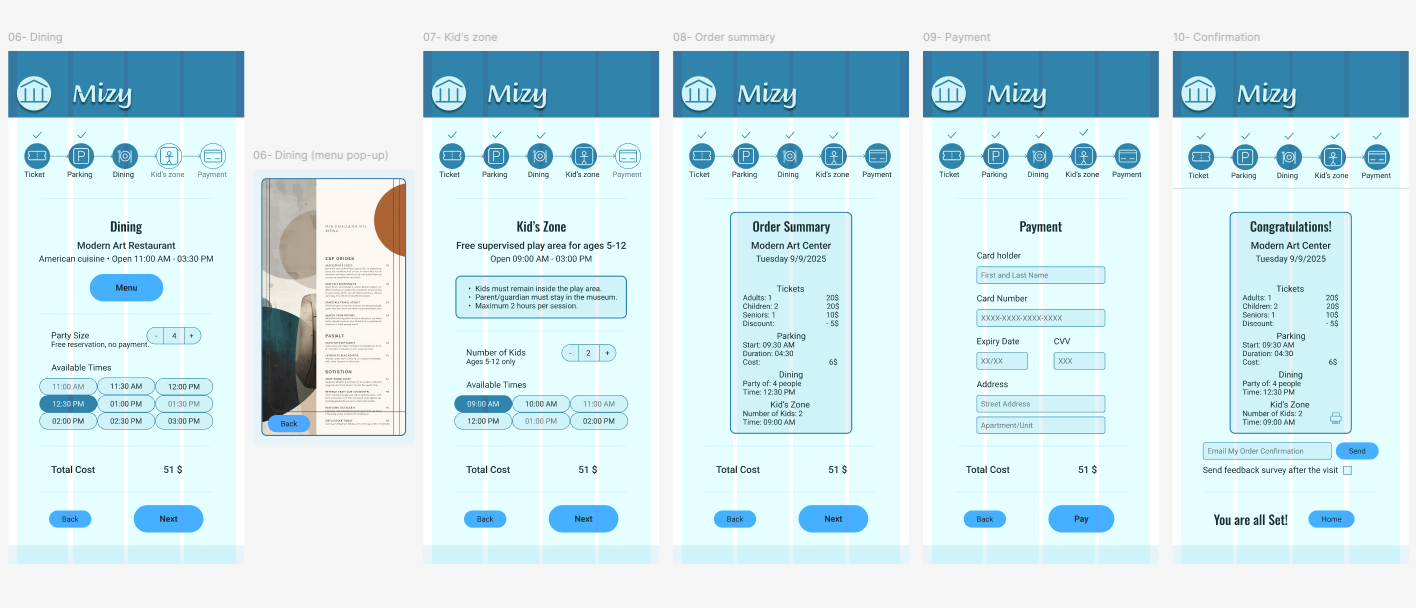
Figure 10. First iteration of high-fidelity mockups created in Figma
_____________________________________________________
High-Fidelity Usability Testing and Refinement
The high-fidelity mockup was evaluated through a second round of usability testing using a similar moderated approach as the low-fidelity prototype. This round focused on validating interaction clarity, visual hierarchy, and overall ease of use. Feedback from this testing informed final refinements before moving to the polished prototype (Figure 11).
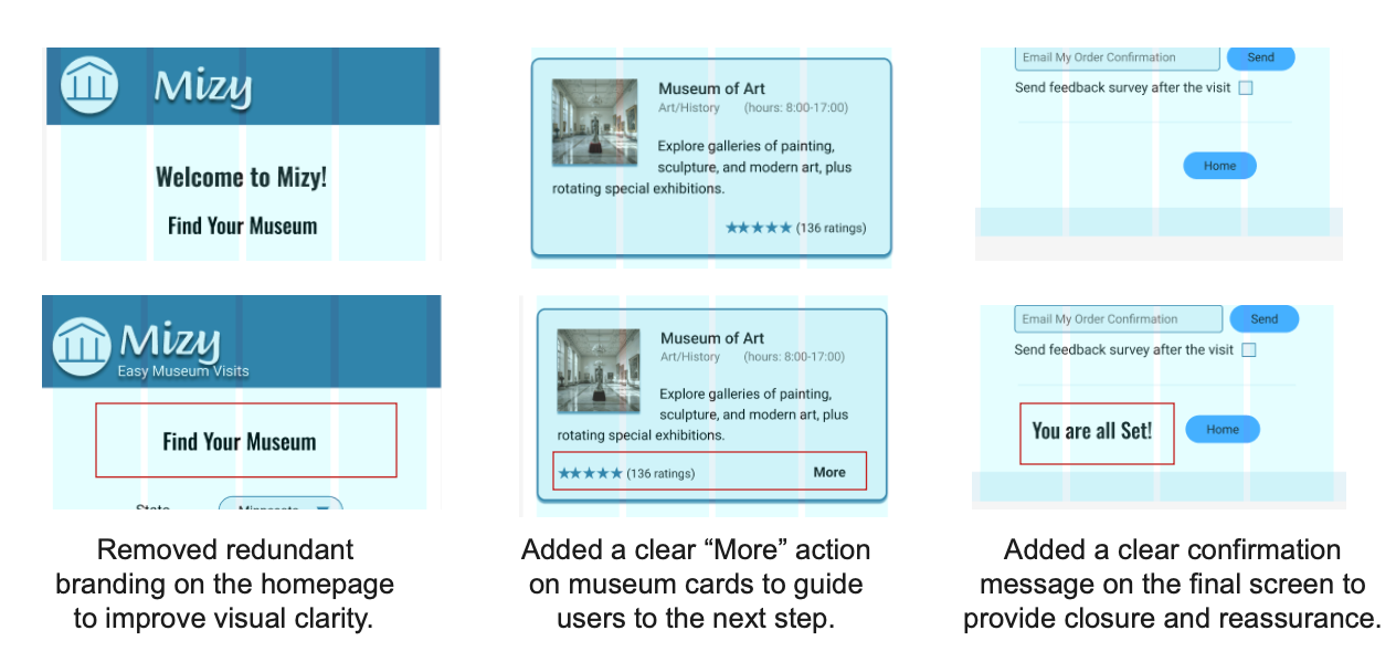
Figure 11. Modifications to the high-fidelity mockups informed by usability study findings
_________________________________________________________________________________________
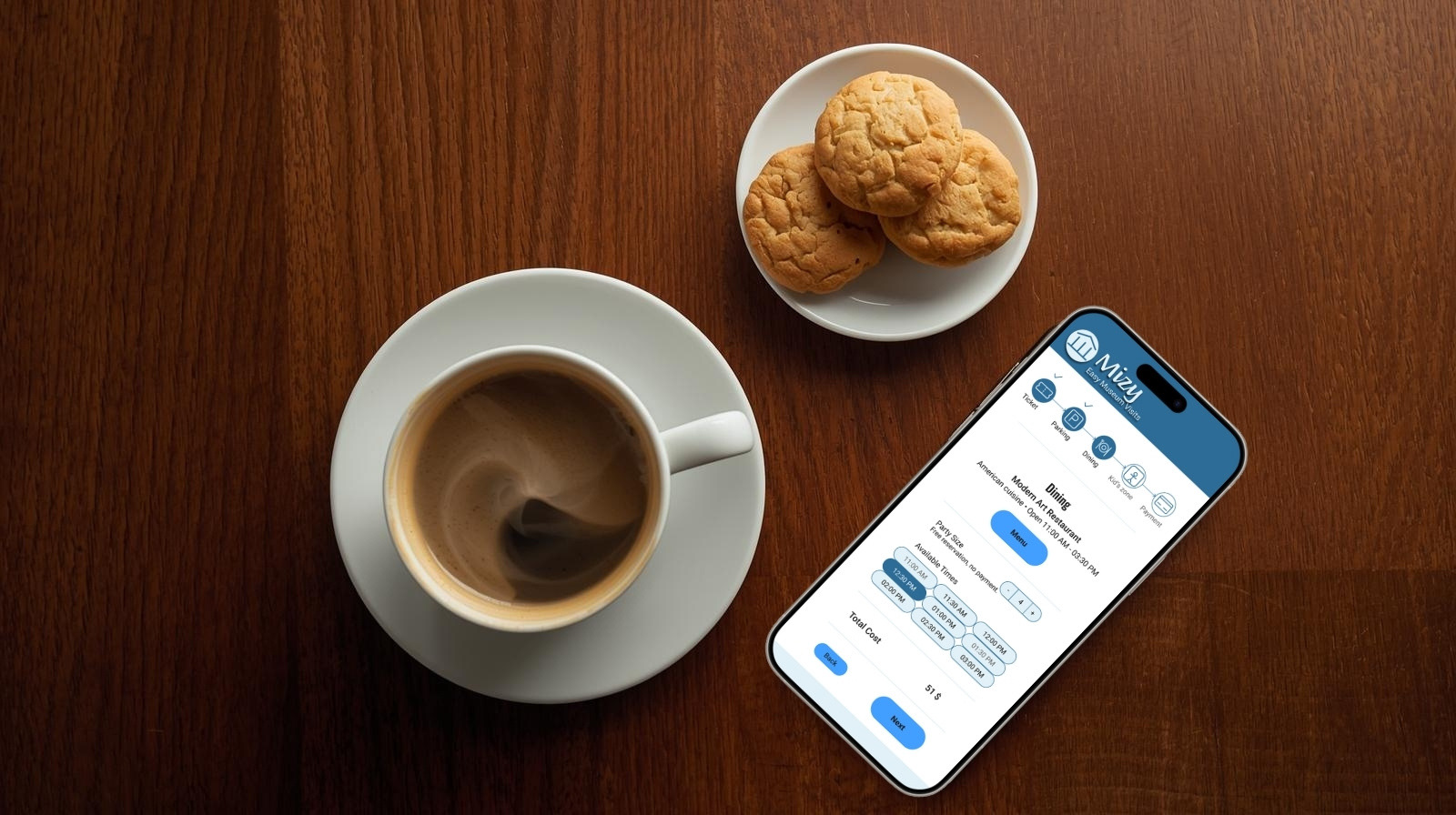
Try the Live Prototype
The final high-fidelity prototype was built in Figma to demonstrate the complete step-by-step experience of planning a group museum visit. The interactive prototype below allows users to explore the refined flow and design decisions informed by usability testing.
_____________________________________________________
Validation
To gain quick, real-world feedback, I conducted informal validation sessions with eight people across a wide age range in a museum lobby in Minneapolis. Participants were asked to try the app on a mobile device and share their impressions of the visual design, ease of use, clarity of the visit-planning flow, and whether they would consider using the app if it were available.
Overall feedback was positive, particularly around the step-by-step structure and clarity of the flow. Participants were able to complete the hypothetical visit-planning task without guidance and described the experience as intuitive and easy to follow. This informal validation increased confidence in the design direction while highlighting opportunities for future, more rigorous testing.
_________________________________________________________________________________________
Conclusion and Lessons Learned
Conclusion
Mizy started as a response to a real and recurring problem. Planning museum visits, especially for families and groups, often feels more complex than it should. Through an end-to-end UX/UI process, I designed a guided, step-by-step experience that prioritizes clarity, ease, and confidence over unnecessary complexity. Iterative testing and refinement shaped the final solution, resulting in a streamlined workflow that supports not only ticket purchasing, but the broader experience of planning an enjoyable group visit.
A key improvement was restructuring the visit-planning flow into a clear, linear process supported by a progress indicator that shows completed steps, the current stage, and what remains. This change significantly improved users’ sense of orientation and control. In addition, simplifying the product identity, from “EasyMuseum” to “Mizy”, improved memorability and reinforced the goal of creating a lightweight, approachable experience.
_____________________________________________________
Lessons Learned
Simplicity is a feature
• Usability testing reinforced that visual complexity and intricate interactions do not improve user experience. What users value most is a fast, low-effort workflow that solves their problem with minimal cognitive load.
Progress visibility builds confidence
• Adding a clear step indicator helped users understand where they were in the process, what they had completed, and what remained reducing uncertainty and hesitation.
Iteration sharpens focus
• Early low-fidelity testing directly informed structural decisions, while later high-fidelity testing refined hierarchy, wording, and confirmation moments. Each round of feedback strengthened the clarity of the experience.
Accessibility must be intentional
• Color contrast, readable typography, alternative text for images, and color-blind–safe combinations were considered throughout the design, reinforcing that accessibility is an integral part of good UX, not an afterthought.
Design systems support consistency
• Creating a small design system early in the high-fidelity phase helped maintain visual coherence and accelerated iteration across screens.
_____________________________________________________
Next Steps
If this project were to continue, I would:
• Conduct a larger, more structured usability study with defined success metrics (task completion, time on task, and error rates).
• Expand accessibility evaluation with assistive technologies and broader user scenarios.
• Explore real-world integration constraints within museum ecosystems, such as ticketing systems, parking availability, and event scheduling.
• Pilot the product with a single museum to evaluate real adoption drivers and refine features that encourage online planning.